Graphical Profile
Maintained by the Technical Department
Profile Guidelines
Changelog
| Version | Date | Changes/notes |
|---|---|---|
| 1.0 | 2019-11-04 |
|
| 1.1 | 2019-11-09 |
|
| 1.1b | 2019-11-11 |
|
| 1.2 | 2019-11-20 |
|
| 1.3 | 2020-10-01 |
|
| 1.4 | 2023-11-12 |
|
| 1.5 | 2025-08-17 |
|
Introduction
This document is created for everyone who are using or just interested in VATSIM Scandinavia’s graphical profile. This document consits of guidelines of how the profile should be treated, with do’s and dont’s. It’s important that everyone follow these guidelines for a uniformed consistency between all our events, services, communication and more
Downloads
🔵 Logo
All variants of the logo: Download
🔤 Font
Roboto font: Download
To download font files from Google, click "Download family" in top right. Read here on how to install fonts on Windows
🪧 Banners
Check out our seperate banner guidelines
📋 Office
Word template: Download simple version or download numbered version with increased readability with chapter numbers and indented text, suitable for longer documents.
PowerPoint template: Download
☁️ Google Drive
Templates are accessible by creating documents “from template” on Drive. If you do not see the template, double check that you’re using the Vatsim Scandinavia Google account, and not your private. Please not that Google Drive doesn’t support numbered headings, so please sure the Office template if you require that
The thoughts behind the logo
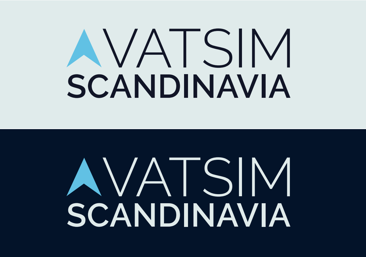
This logo is trying to represent Scandinavia. What is common for whole Scandinavia is that it’s North-Europe, or just “North”, hence the arrow that’s pointing north.
The arrow is created so it matches the size and look of the font and letter “V” in Vatsim. The color of the arrow is chosen to be blue-breeze to represent our colder climate up north. The darker text color is dark blue midnight. When you look at logo on the darker backgrounds, the white-looking color is very very light blue tint, just like snow. As you might understand by now, the shades of blue, representing our climate and belonging to “up north”.
The design is focused to be “flat-design”, with solid lines, colors and angles. Meaning no more gradients, 3D effects or similar.
Here are both a positive and negative version of the logo, where both versions are valid to be used, choosing the fitting style for the specific background
Color profile
| Name | Sample | Hex | RGB | HSV | CMYK |
|---|---|---|---|---|---|
| Primary | #43c6e7 | 67 198 231 | 192 71 91 | 71 14 0 9 | |
| Secondary | #1a475f | 26 71 95 | 201 73 37 | 73 25 0 63 | |
| Tertiary | #011328 | 1 19 40 | 212 98 16 | 98 53 0 84 | |
| Grey | #484b4c | 72 75 76 | 195 5 30 | 5 1 0 70 | |
| Snow | #dfebeb | 223 235 235 | 180 5 92 | 5 0 0 8 | |
| Success | #41826e | 65 130 110 | 162 50 51 | 50 0 15 49 | |
| Danger | #b63f3f | 182 63 63 | 0 65 71 | 0 65 65 29 | |
| Warning | #ff9800 | 255 152 0 | 36 100 100 | 0 40 100 0 |
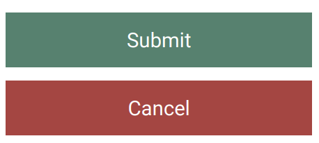
- The design profile is “flat design”, therefore, where possible, avoid using rounded corners in general.
- Regarding buttons and accessible design: To maintain good contrast within buttons, the font text should be white, and not “Snow”.
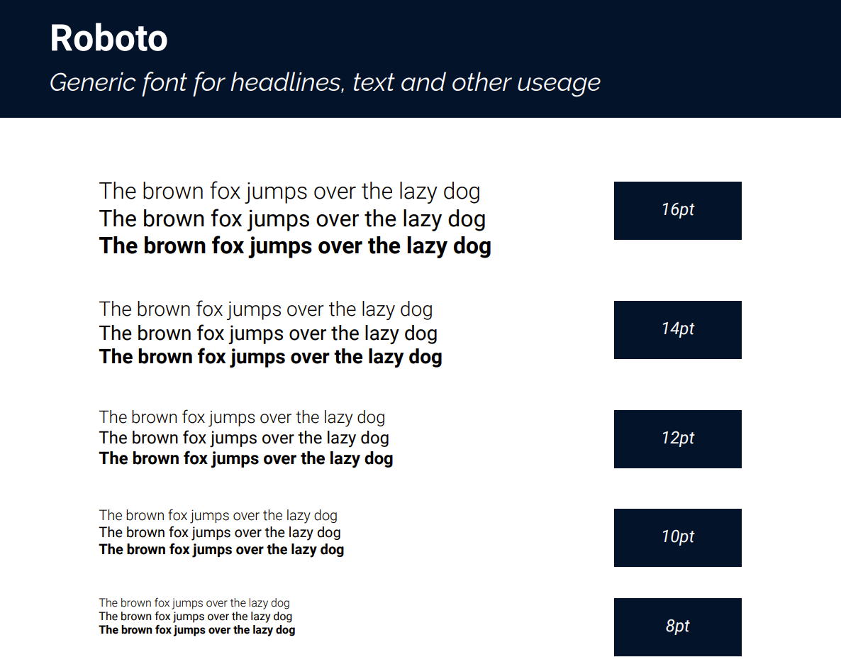
Typography
E-mail signature
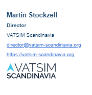
This is made with Gmail standard signature editor.
- Font: Sans Serif
- Name: Size Normal, bold, color
- Title: Size Small, bold, color
- Rest: Size small, color
Picture is email.png with Gmail scale Small

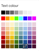
The color is this one below from the Gmail pallette
Logo guidelines
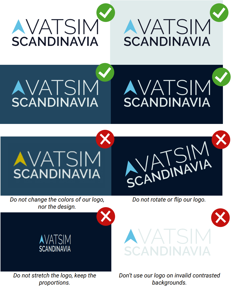
You may use the logo in positive and negative variant, depending on the background.
There is also a all-black and all-white variant which is not illustrated here, but this is only ment to be used in special cases like formal documents or where colors are not deemed to fit.
Banner Guidelines
⚙️General Guidelines
Event title/logo
- Event titles must clear and easy to read. The title also tells what the event is about.
- The VATSIM Scandinavia logo must be clearly displayed, recommended size is 80px in height. When applicable, other logo is placed with our logo, well spaced and in same size.
- Make sure to follow the logo guidelines
Event information
- Event dates must be in the day, month format (17th February). Repeating events should include the weekday.
- If it's an exam, it should also be added to the banner like: "S2 Exam", "Tier 1 Validation" etc.
- Event airport must include the ICAO code.
- Times must be in a 24 hour, Zulu format, with a start time. End time is highly reccomended to be included
Font
Font for the templates is Roboto. The font can be downloaded directly from Google Fonts.
Export
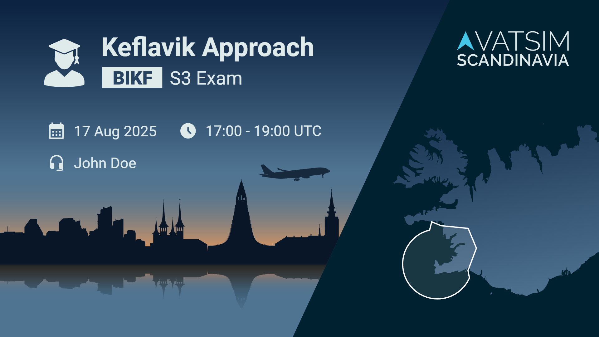
🎓 Exam/CPT Banners
Colors
No deviations or changes allowed.
Templates
🎈Event Banners
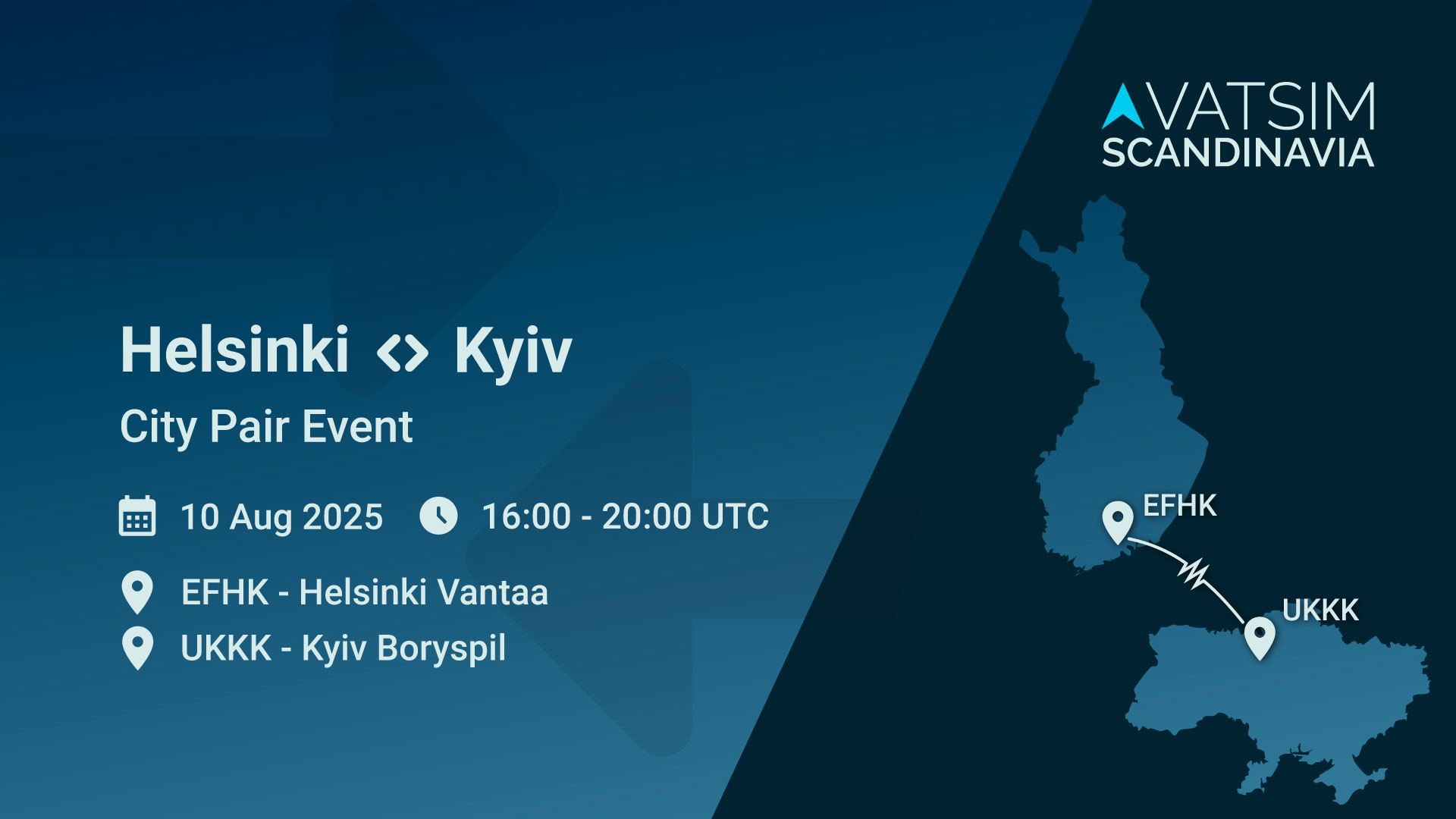
For events we have three different standard banners. In these you're more free to change things like the pictures and text as long you keep the Scandinavian feel of it.
Standard with full size image

Standard with a partial image in the fold

City Pair
Colors
Please use the official colors of VATSIM Scandinavia found in the graphical guide. Shades of the primary colors are allowed as long it remains the blue/northy look.
Templates
- Illustrator Template by Otto Tuhkunen
🤹♂️ Off-brand Banners
Off-brand event banners may be created for events by approved members. To be approved an off-brand banner creator, present some high quality banners you have created to the Event Manager. The Event Manager will consult with the Tech Department whether or not the submitted banners are in line with the expected quality.
Approved off-brand designers
- Jesper Hvenegaard
- Otto Tuhkunen